When you think about home design, you might not immediately consider the psychological impact of colour, yet it’s a powerful tool at your disposal.
By understanding how different hues influence emotions and perceptions, you can transform any space into a sanctuary or energising hub. Have you ever wondered why some rooms feel more inviting than others?
It often comes down to colour choices. From boosting kerb appeal to enhancing property value, the right palette offers more than just aesthetic benefits. So, how can you harness this knowledge to craft spaces that truly resonate with you?
Understanding Colour Psychology
When you start exploring colour psychology, it becomes clear that colours influence emotions and behaviours in profound ways. Your choice of colours can transform a space, affecting how you and others feel when entering a room.
Imagine walking into a room painted in a calming blue; you might immediately feel more relaxed. In contrast, a vibrant red room could energise and increase your heart rate. Each colour has its own psychological impact, and understanding these effects can help you create the desired atmosphere in your home.
Take yellow, for example. It’s often associated with happiness and warmth, making it perfect for areas where you want to encourage social interaction, like the kitchen or dining room.
Meanwhile, green, reminiscent of nature, brings a sense of tranquillity and balance, ideal for bedrooms or home offices where calmness is essential.
As you investigate deeper into colour psychology, you’ll notice that even shades and tones can alter perceptions. A soft pastel might soothe, while a bold hue can make a statement.
Choosing the Right Palette
Selecting the right colour palette for your home can be an exciting yet challenging task, as it requires a balance between aesthetics and emotional impact.
Start by considering the function of each room. For instance, calming shades like blues or greens work well in bedrooms, promoting relaxation. In contrast, vibrant colours such as reds or yellows can energise spaces like kitchens or living areas.
Next, assess the natural light each room receives. A room with plenty of sunlight can handle cooler tones, while a dimly lit space might benefit from warmer hues to create a cosy atmosphere.
Don’t forget to factor in the fixed elements in your home, like flooring, furniture, or countertops. You’ll want your colour choices to complement these existing features.
Remember to test paint samples on your walls before committing. Colours can look different depending on the time of day and lighting conditions. Use large swatches and observe them over several days.
Also, consider how the colours shift from room to room, ensuring a harmonious flow throughout your home.
Finally, trust your instincts. Your home should reflect your personality and style, so choose colours that resonate with you.
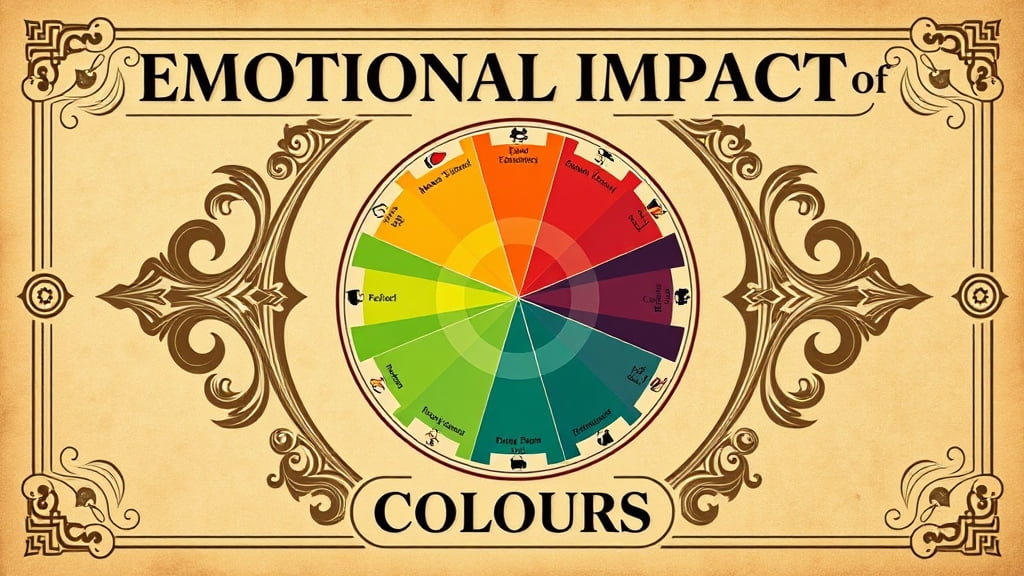
Emotional Impact of Colours
Understanding the emotional impact of colours is a key part of choosing your home’s colour palette. Colours can influence your mood and the atmosphere of your space.
For instance, blue often evokes calmness and serenity, making it perfect for bedrooms or relaxation areas. Red, on the other hand, is bold and energising, ideal for spaces meant for social interaction, like dining rooms or living areas.
Consider yellow if you want to create a cheerful and welcoming environment. It’s often associated with happiness and positivity, making it a great choice for kitchens or entryways.
Green, reminiscent of nature, can bring a revitalising and balanced feel to any room, promoting comfort and harmony.
You might be drawn to purple if you’re aiming for a sense of luxury and creativity. It’s a versatile colour that can add depth and sophistication.
Meanwhile, neutrals like beige, grey, or white offer flexibility and calm, allowing you to incorporate different accents and styles easily.
When planning your home’s design, think about how each colour makes you feel and how those emotions align with the purpose of each room.
This thoughtful approach guarantees your home reflects your personality and meets your lifestyle needs.
Colours for Small Spaces
Optimism flourishes in small spaces when the right colours are chosen, transforming compact areas into inviting and functional havens. Light colours like soft whites, pale blues, and gentle greens can make a room feel larger and more open. These hues reflect natural light, creating a sense of airiness and expanding the perceived space.
When painting walls, consider using shades that have a hint of warmth. They not just brighten the area but also add a comforting touch.
If you want to introduce some contrast or depth, opt for accent walls in deeper tones, such as charcoal grey or navy blue. These rich shades add character without overwhelming the room. You can also use them in furniture, textiles, or decor to ground your space without making it feel cramped.
Don’t forget about the ceiling! A lighter ceiling colour can make it appear higher, giving your room a more spacious feel. Additionally, incorporating mirrors strategically can reflect light and enhance the sense of depth.
In small spaces, every detail counts, so choose colours that not just suit your style but also enhance the overall vibe, making your compact area feel welcoming and expansive.
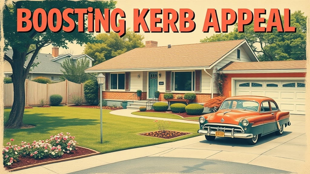
Boosting Kerb Appeal
Enhancing your home’s exterior with the right colours can greatly boost its kerb appeal, making a lasting impression on visitors and passers-by. Your choice of colours sets the tone for your property and can dramatically influence perceptions.
To achieve a striking, inviting facade, consider these key points:
- Front Door Focus: Choose a bold colour for your front door to create a focal point. A vibrant red, deep blue, or even a cheerful yellow can act as a welcoming beacon and convey personality.
- Complementary Trim: Use a complementary colour for trim and accents. This can highlight architectural details and add depth. Light trims on a dark house or vice versa can create a striking contrast.
- Harmonious Palette: Confirm that your colour choices harmonise with the surrounding landscape. Natural tones, like greens and earth colours, can beautifully blend with gardens and trees, while urban settings might suit more neutral or subdued hues.
- Seasonal Considerations: Consider how colours change with the seasons. A colour that looks vibrant and fresh in summer should still appeal during the winter months. Test samples in different lighting conditions to confirm year-round kerb appeal.
These strategies will help you create an exterior that stands out in the best way possible.
Creating a Relaxing Atmosphere
While the exterior of your home sets the stage, the interior colours play a pivotal role in creating a relaxing atmosphere. Choosing soothing hues can transform your space into a sanctuary of calm and tranquillity. Soft blues, greens, and muted pastels are excellent choices for walls and furnishings as they evoke feelings of peace and serenity.
These colours naturally reduce stress and promote a sense of well-being, helping you unwind after a long day.
In addition to choosing the right colours, consider the balance of light and shade. Natural light enhances the calming effect of gentle colours, so make sure your space is well-lit during the day. At night, use soft, warm lighting to maintain the peaceful ambience.
Candles or lamps with dimmers can also add to the soothing atmosphere.
Texture also plays a significant role. Incorporate plush fabrics and natural materials like wood or stone to create a cosy, inviting environment.
These elements work with your colour choices to enhance relaxation and comfort. Finally, personalise your space with meaningful artwork or mementoes that bring joy and peace.
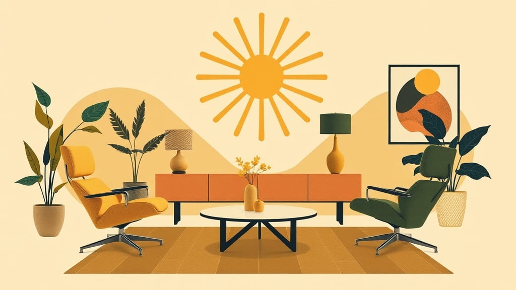
Energising Interior Spaces
To infuse energy into your interior spaces, consider using vibrant colours that invigorate and inspire. Bold hues can transform a room, making it lively and dynamic. Start by considering colour choices that reflect this energetic vibe.
- Red: Known for sparking passion and excitement, red can elevate the heart rate and create a sense of urgency. Use it in areas where you’d like to foster conversation and activity, like the dining room or living space.
- Orange: This cheerful colour exudes warmth and enthusiasm. It’s perfect for spaces where creativity and collaboration thrive, such as a home office or a creative studio.
- Yellow: Bright and optimistic, yellow evokes happiness and stimulates mental activity. It’s ideal for kitchens or breakfast nooks, creating a sunny atmosphere that welcomes the start of each day.
- Green: While often associated with calmness, bright shades of green can energise and refresh. Use it in areas like the bathroom or workout room to promote liveliness and renewal.
When you use these colours strategically, you can transform any space into an environment that pulses with energy and positivity.
This encourages productivity and engagement as you go about your day.
Enhancing Property Value
The colours you choose for your home can greatly impact its market value. A well-thought-out colour scheme can make your property more appealing to potential buyers and increase its desirability.
Neutral colours, like soft greys, whites, and beiges, are timeless and create a blank canvas that allows buyers to envision their own style. These shades also help rooms appear larger and more inviting, which can be a significant selling point.
Consider the exterior colour as it sets the first impression. A fresh coat of paint in colours like classic white, warm earth tones, or muted blues can enhance kerb appeal. This doesn’t just attract buyers but also suggests that the property is well-maintained.
Inside, accent walls in subtle but trendy colours can add character without overwhelming the space. Colours like sage green or muted terracotta offer modern touches that can appeal to younger buyers.
Seasonal Colour Considerations
An often overlooked aspect of home design is the influence of seasonal colours on mood and atmosphere. By aligning your home’s colour palette with the seasons, you can create spaces that feel fresh and inviting year-round.
Each season offers a unique set of colours that can evoke different feelings and energies in your home.
- Spring: Embrace the renewal of life with soft pastels like lilac, mint green, and peach. These colours bring a sense of calm and freshness, perfect for rejuvenation after a long winter.
- Summer: Capture the vibrant energy of the season with bold hues such as sunny yellows, ocean blues, and coral. These colours can make your space feel lively and bright, mirroring the long, sun-filled days.
- Autumn: Reflect the warmth and cosiness of autumn with earthy tones like burnt orange, deep red, and mustard yellow. These shades can add warmth and comfort as temperatures drop.
- Winter: Opt for cool, muted colours such as icy blues, crisp whites, and charcoal. These tones can create a serene and peaceful environment, providing a perfect backdrop for cosying up indoors.
Adjusting your home’s colours seasonally can enhance your living experience and reflect nature’s rhythm.

Personalising Your Design Choices
Creating a personalised colour scheme for your home design is about expressing your unique style and preferences. Start by considering which colours resonate with you and reflect your personality.
Do you find peace in soft, muted tones, or does a bold, vibrant palette excite you? Knowing your colour preferences helps set the foundation for a space that feels authentically yours.
Consider the purpose of each room. For instance, calming blues and greens might work well in a bedroom to promote relaxation, while lively yellows or reds can energise a kitchen or living room. Think about how different colours make you feel and choose accordingly. It’s your space, and it should feel right for you.
Don’t shy away from experimenting. Mix and match colours to see what combinations spark joy or creativity. You can also incorporate personal touches through accent pieces or artwork that reflect your taste.
Remember, there’s no right or wrong regarding personal choice—only what feels best for you.
Finally, trust your instincts. If a colour makes you happy, it belongs in your home. Your design choices should be a true reflection of who you are.
Conclusion
Incorporating the psychology of colour into your home design can transform your space into a harmonious sanctuary. By selecting the right palette, you’ll evoke desired emotions and create inviting atmospheres.
Don’t underestimate the power of colour in small spaces or its ability to boost kerb appeal. Energise interiors and enhance your property’s value with thoughtful choices. Remember to adapt to seasonal changes and personalise your design to reflect your unique style.
Please don’t hesitate to contact Classico Painting if you need any assistance in choosing the right colours for your property.


